
Real product example

Watch 77 Rules find what this dashboard misses.

One real Marketing Channel Dashboard audit. See the violations on the image, the scores, the ranked findings, and the exact fixes the product recommends.

Self-serve software. Upload, review, fix, and re-audit.
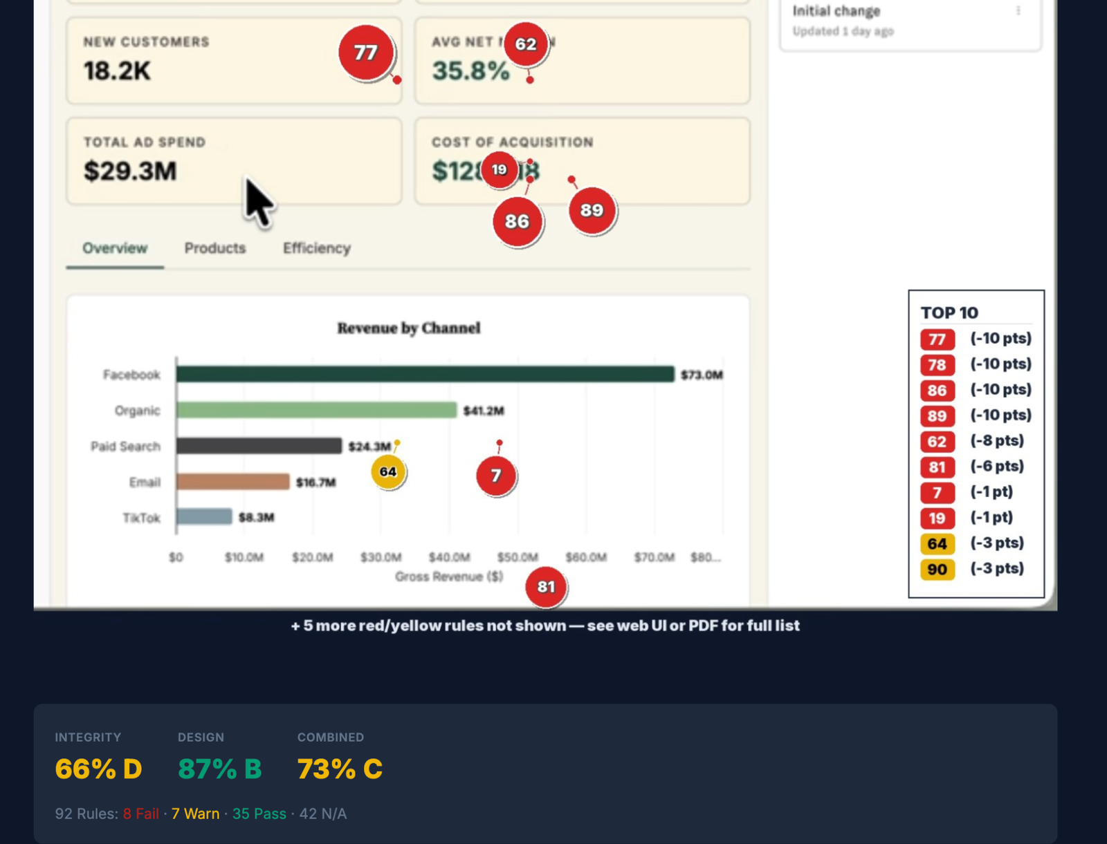
Annotated Marketing Channel Dashboard with numbered violations, a top-ten legend, and integrity, design, and combined scores
Actual audit result

Strong design. Weak integrity.

The dashboard looks polished, but the audit separates visual quality from whether the numbers are sufficiently contextualized and consistently presented.

Integrity
66% D

Context, meaning, and consistency issues carry the largest risk.

Design
87% B

The dashboard is visually organized and largely readable.

Combined
73% C

The integrity findings pull down an otherwise strong visual result.

8 fail 7 warning 35 pass 42 not applicable
Interactive mini-demo

See the product workflow at your speed.

Choose fast, normal, slow, or manual. Follow one real Marketing Channel Dashboard audit from annotated evidence through ranked findings, heatmaps, and category drilldowns.

Use the speed control, pause anytime, or move one screen at a time.

Step 1 of 6

Run an audit.

Run a new audit, revisit prior results, export a PDF, or re-audit after corrections.

Visible in the productAudit history, New Audit, PDF export, Delete, Re-Audit, and annotated versus original views.
1 / 6
Actual ranked findings

The product explains the failure and the correction.

These are the three high-priority findings visible in the application screenshot, not hypothetical examples.

Rule 77: Fail

Add comparative context.

Six prominent KPI cards show absolute values without immediate baselines, targets, or trend indicators.

Why it mattersGross revenue, total orders, new customers, margin, ad spend, and acquisition cost are difficult to interpret without knowing whether each number is improving, deteriorating, or missing its target.
FixAdd comparisons such as versus previous period, versus target, or a compact trend indicator to each prominent KPI.
Rule 78: Fail

Add a clear time range.

The dashboard includes an “All Years” filter, but it does not clearly state the period covered by the KPI cards or Revenue by Channel chart.

Why it mattersA reader cannot tell whether the values represent year to date, the last 30 days, a quarter, or another reporting window.
FixAdd a specific time range to the title or subtitle, such as Year to Date, Last 30 Days, or Q3 2023.
Rule 86: Fail

Standardize monetary units.

Cost of Acquisition displays $128.418 while Gross Revenue and Total Ad Spend use $163.6M and $29.3M.

Why it mattersMixed scaling makes the units ambiguous and forces the reader to infer whether the acquisition-cost value is dollars, thousands, or millions.
FixUse consistent K or M suffixes where appropriate, or display all monetary values in full.
After the audit

Fix, dismiss, export, or re-audit.

The application supports the complete review loop visible in the screenshots.

1

Review evidence

Open the ranked findings or use the heatmap and category views to inspect the full result.

2

Dismiss a finding

Remove a finding from consideration when the visible evidence does not apply to the dashboard’s actual context.

3

Export the PDF

Use the PDF action to preserve and share the completed audit output.

4

Re-audit

Upload the corrected dashboard and run the audit again to see what improved.

About the sample report: The prior website sample was removed because it was simulated. A public PDF example should be added only when it is exported directly from the application.
Watch a full review

See the method applied to a polished Tableau dashboard.

The video shows how a dashboard can score highly on design while still needing integrity corrections before it is trusted.

Tableau Keynote Dashboard Review
Design score: 97%. Integrity score: 79%.
What to watch for

Visual polish and dashboard integrity are different tests.

  • How the audit separates design quality from integrity risk.
  • How findings are tied to visible dashboard evidence.
  • How corrections are prioritized instead of delivered as a generic design critique.

Run the same review on your dashboard.

Upload it, see the highest-impact findings, fix it, and re-audit it.

Start Dashboard Review